Innovating Nostalgia

Game Dev
IP Development
Visual Design
Player Experience
Game Design
Product Designer • Animator • Lead Artist • Narrative Designer
Context
I Wanted to Create a World
As a designer and writer, I wanted to challenge myself with the ultimate design challenge
Creating an entire video game pushes the boundaries of what a user experiences by evolving past UI and beyond task completion. Developing a world for players to explore, environments to interact, and designing intuitive gameplay and building a compelling world adds a 3rd dimension to product design.
The Problem to Solve
Creating a brand-new IP that people can connect with isn’t as easy as it might seem
Designing and animating characters, enemies, trees, grass, visual effects.
Creating scalable and reusable assets for various ground types, buildings, equipment, iconography, typography, interfaces.
Level design, game conceits, look, feel, and atmosphere established through ambient design
Structuring the information architecture, development roadmap, and prioritization and much more.
Generally, these are handled by entire teams dedicated to each specific task. I’m taking it on by myself.
Here is a glimpse into that journey.
The Impact of My Decisions
Visual Design Styling Established
Retro Meets Modern
With the mindset of “Innovating Nostalgia” at its core, ChivalBee’s game aesthetic calls back to retro game visual design with all of the modern tools and capabilities. From shader graphs VFX to enhanced audio design.
Mechanics Taught Through Gameplay
Games Shouldn’t Stop You from Playing Them
The level design in tangent with visual and audio cues are structured in such a way that there are no modals or windows stopping the gameplay to teach you how to play. You learn by playing, constantly in a state of discovery, and that’s how it should be.
The Protagonist is Fun and Engaging
Buzzby is driven and everything about him supports that
From his playstyle to his animations, I took great care into ensuring that his visual design reflected his personality. The choices made reflect a tenacious bee with insurmountable determination to save his Queendom.
Designing ChivalBee
Continue scrolling or select to jump to that section
Defining a Visual Style
Existing Design Review
Detailed Review
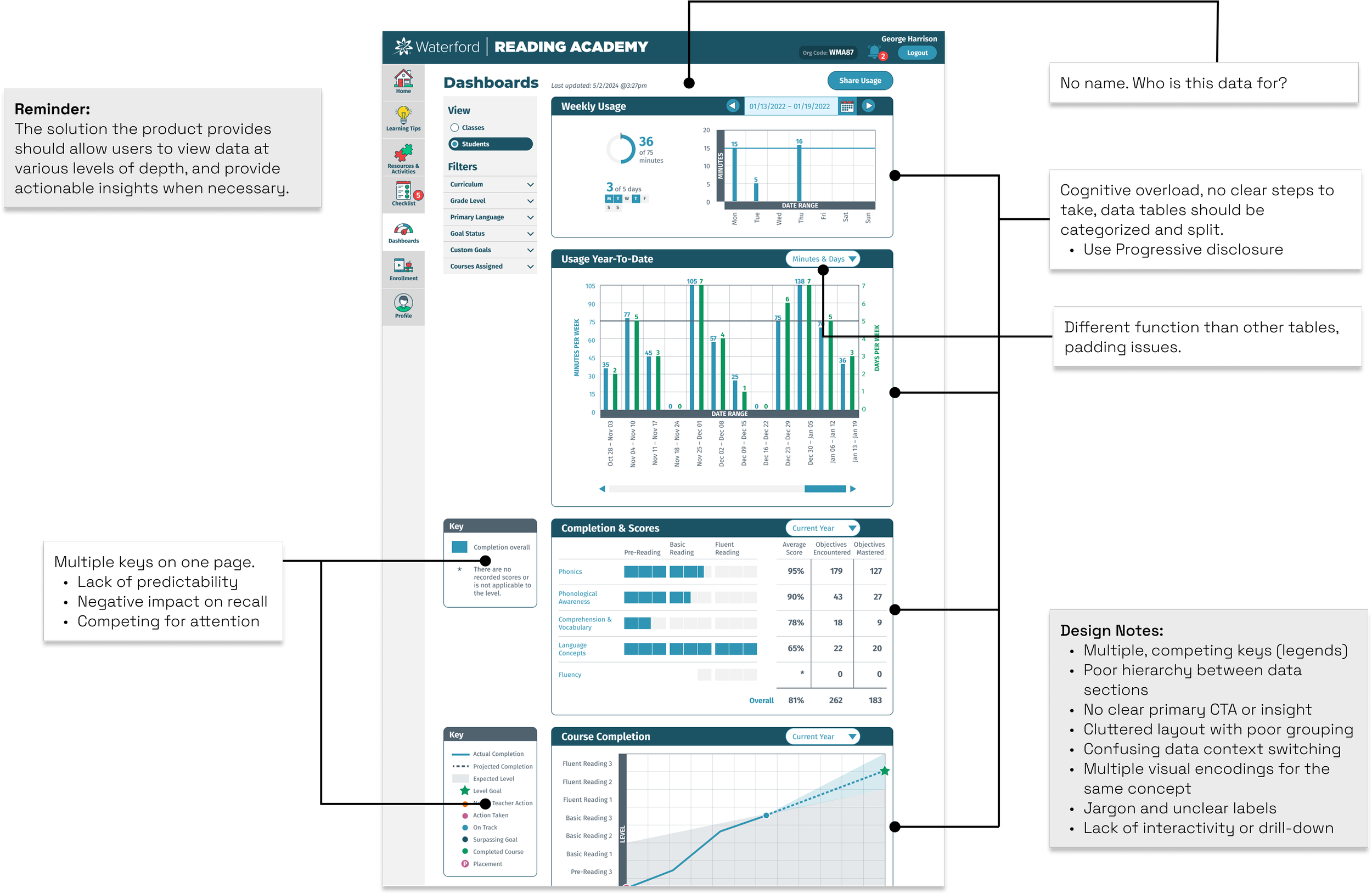
A detailed review of the current experience confirmed what was discovered in the research phase and allowed me to establish what design principles would guide the process.
Design Principles
Clarity over Density
Simplify data views. Teachers don’t need school-wide data, and principals don’t need district wide usage data. Make each view focused on what the user needs.
Actionable UI
Make it clear what was being looked at. Design calls to action when necessary. Make what happens after CTA’s are clicked predictable and simple to follow through.
Role-Based Simplicity
Remove unnecessary options and cognitive overhead.
Consistency through Design Systems
I led the design system efforts for the shared front-end library. This was a perfect place to implement a modular card-based component I had been working on with another designer.
Wireframe and Whiteboxes
Communicating Changes
Making sure everyone understands why designs choices are made is an integral part of the process.
Checking with Developers
Even though we were using a design system that was already approved by developers, I still meet with the engineers working on this to ensure all aspects of the design are still within their constraints.

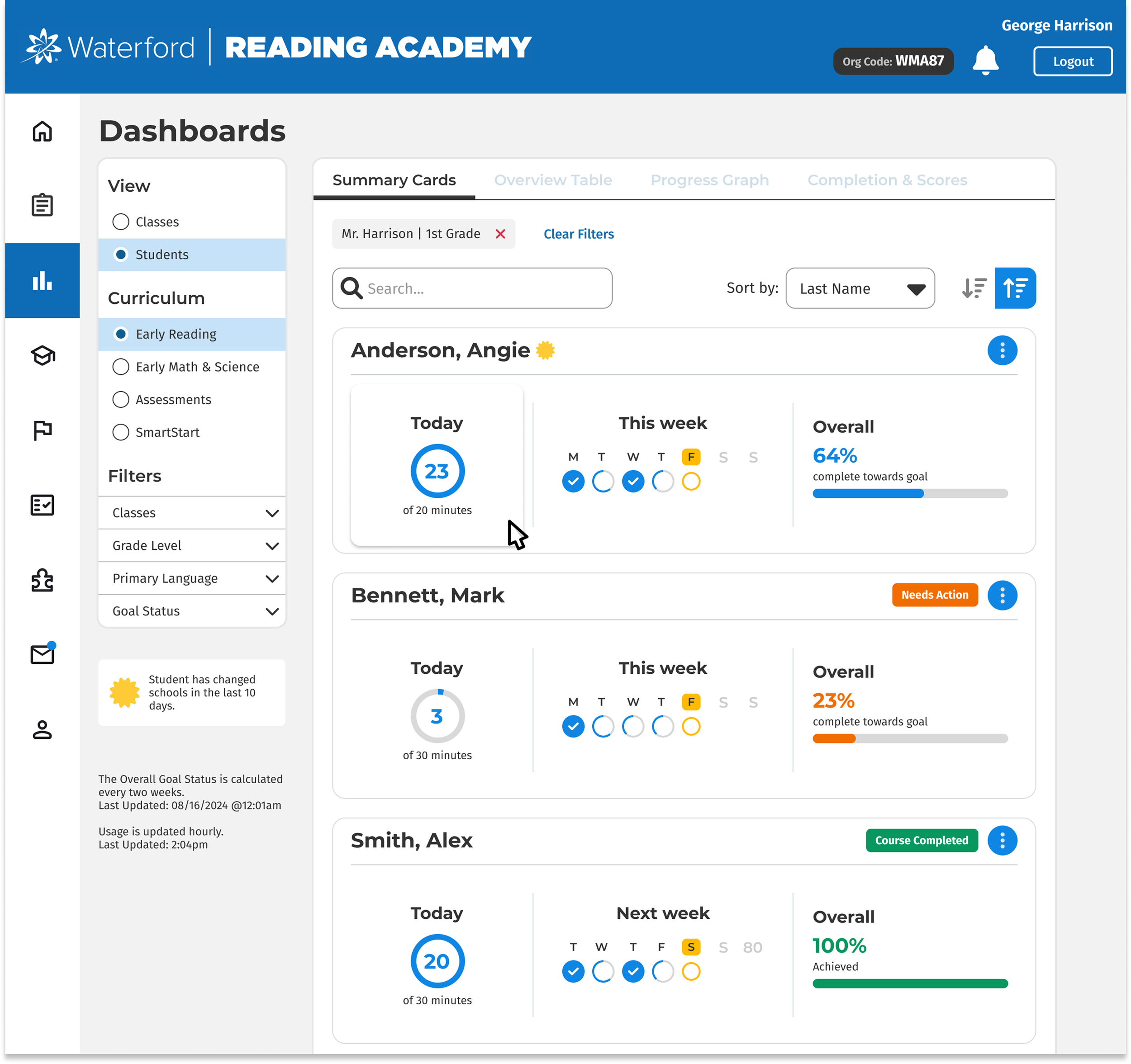
Updated Design
Pages and Tabs
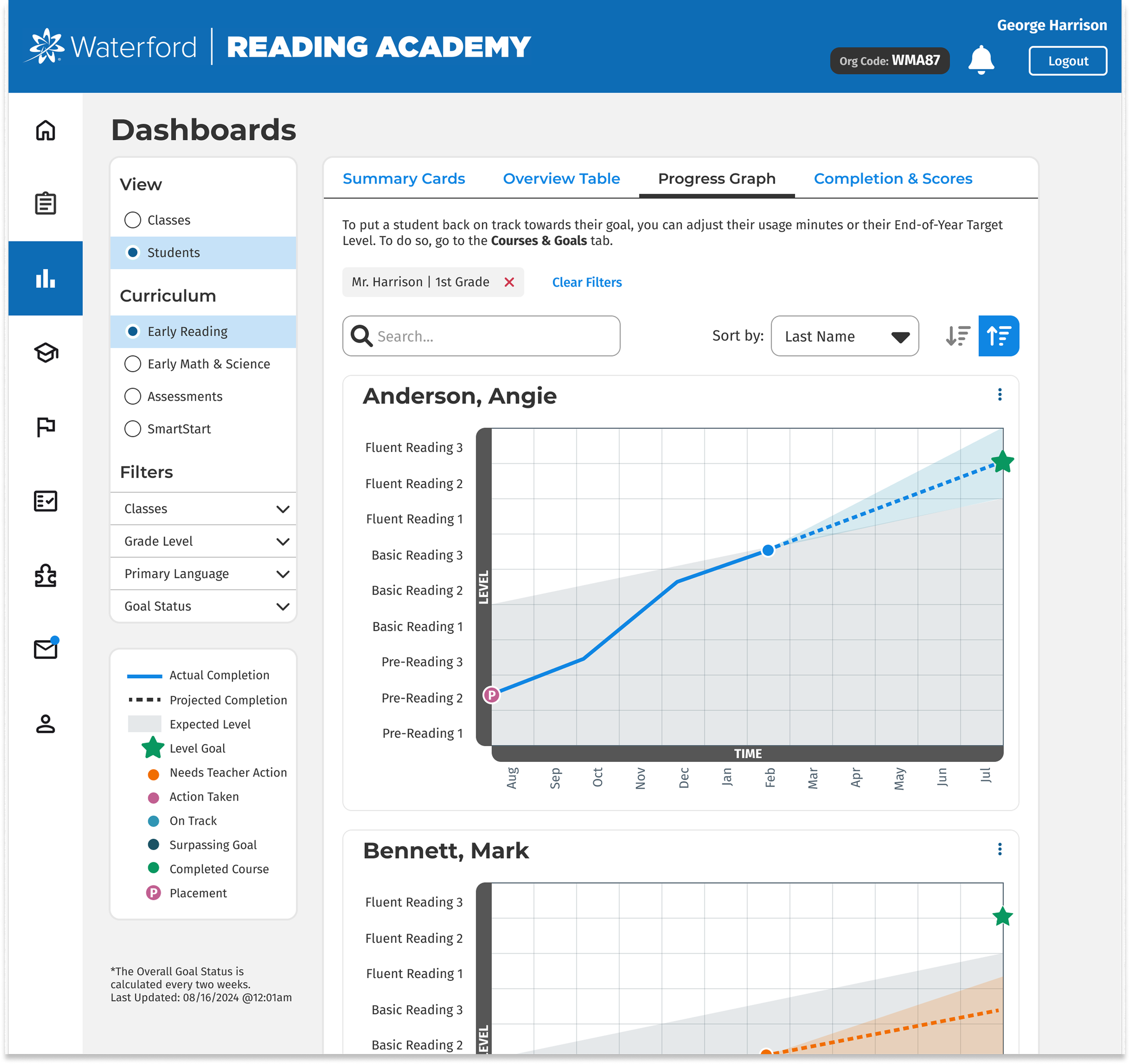
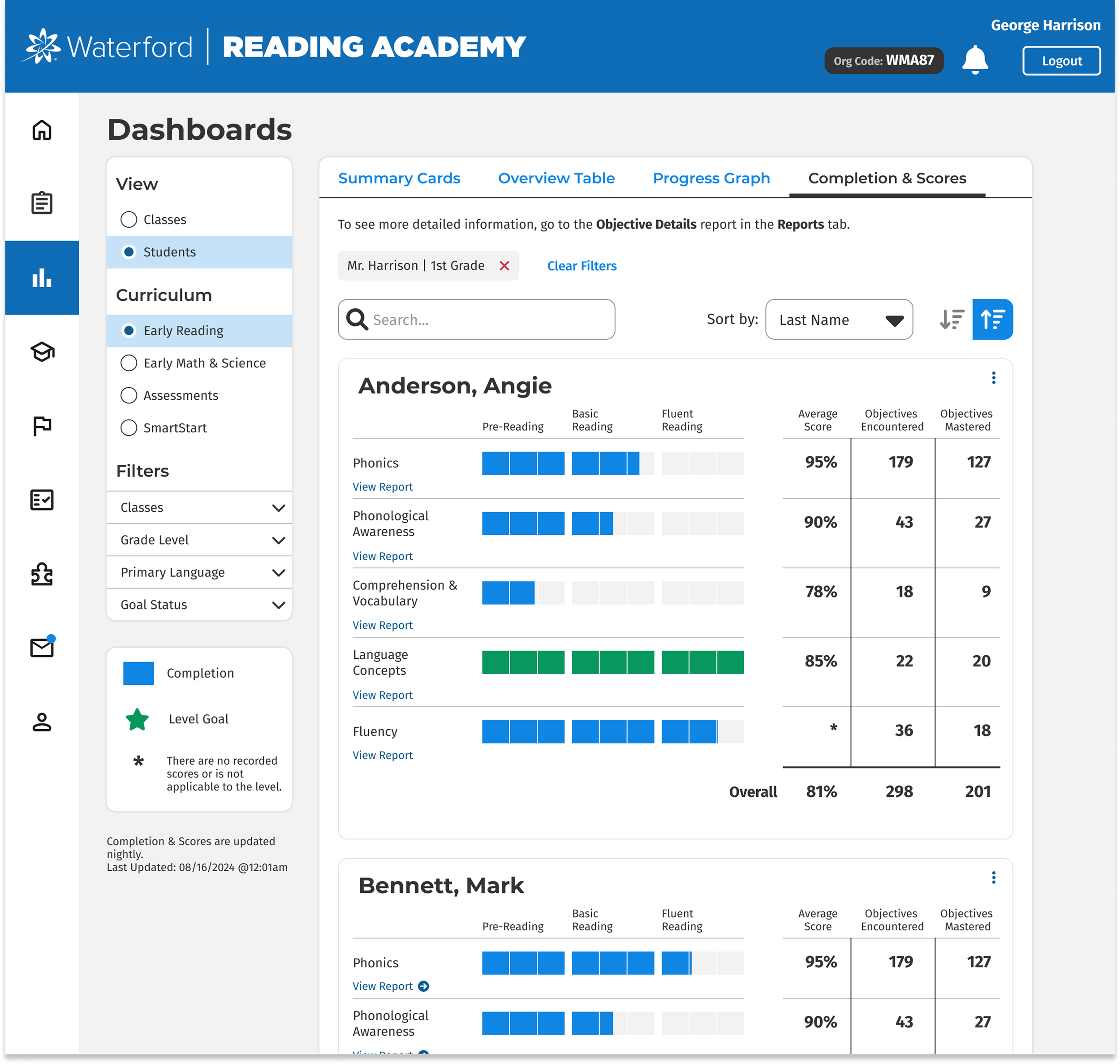
Reducing cognitive load by breaking different data sets and tables into different tabs at the top, allow users to view the set of data when they need it
Filtering and Search
Quick filters allow users to narrow down data sets into the criteria they’re looking for. Search available for specific names of students.
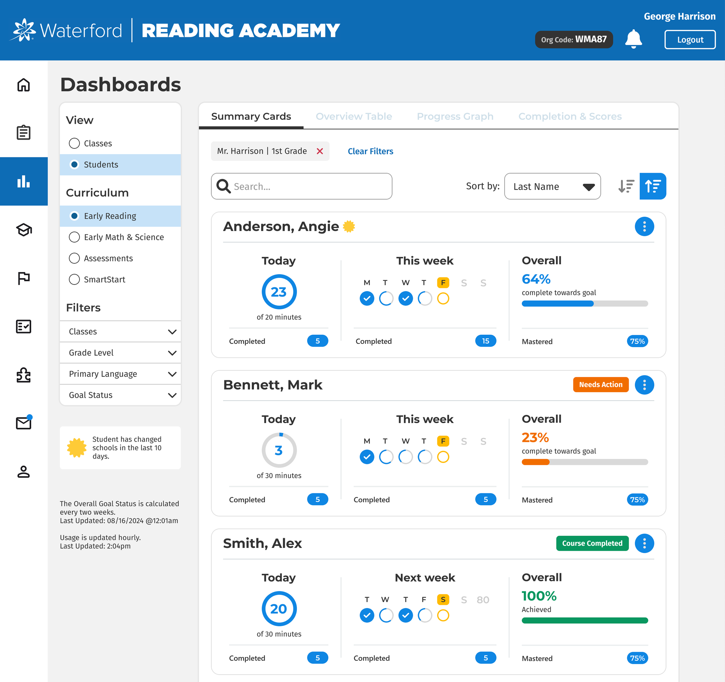
Data Labels
Clear labeling around the cards presented users with a summary of a student’s progress. This view also carried over into:
School-wide classroom metrics
District-wide school metrics
Testing and Iterating
While the redesign was met with very positive reception, there were still a few tweaks to be made.
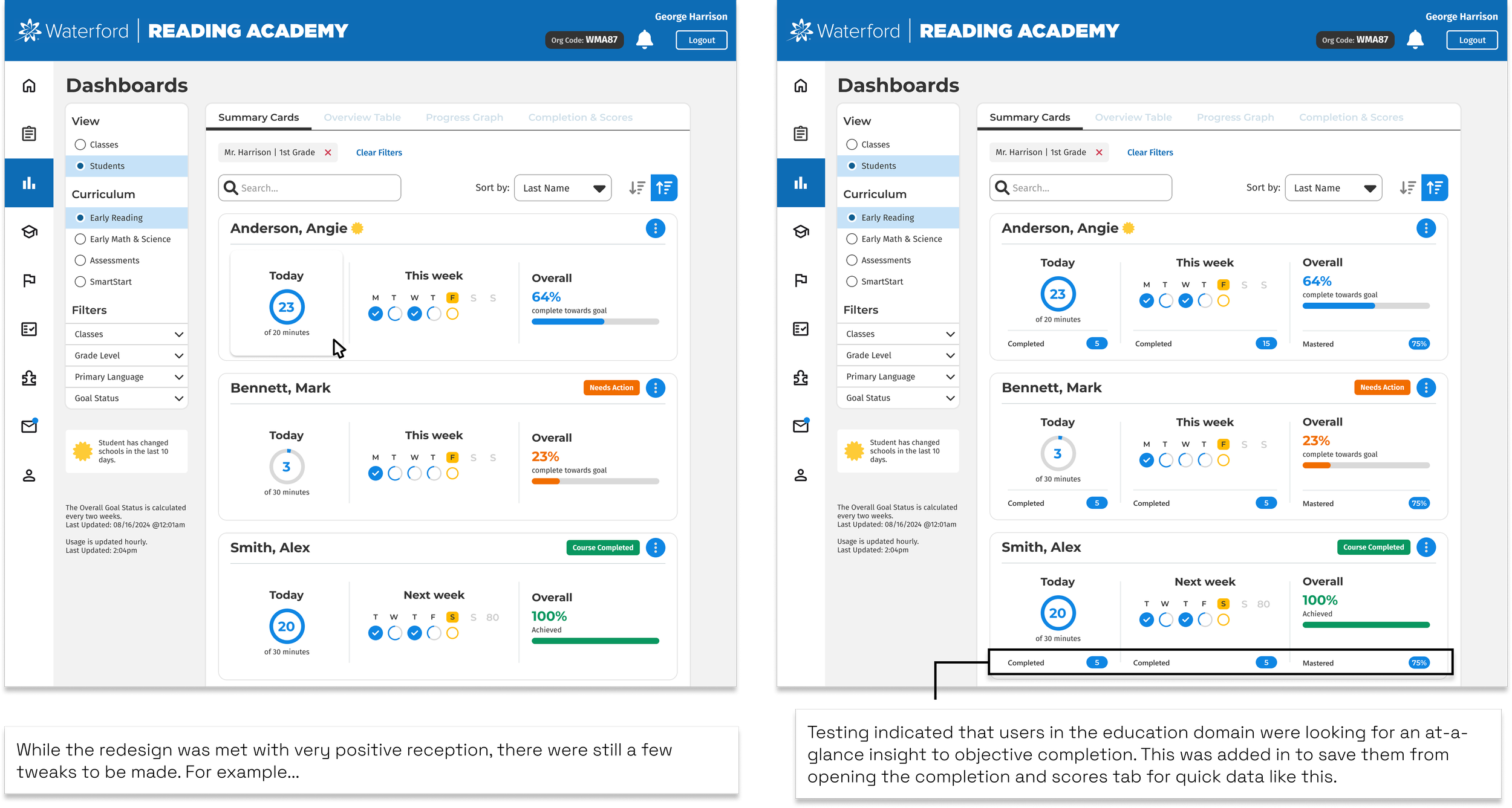
Testing indicated that users in the education domain were looking for an at-a-glance insight into objective completion. This was added in to save them from opening the completion and scores tab for quick data like this.
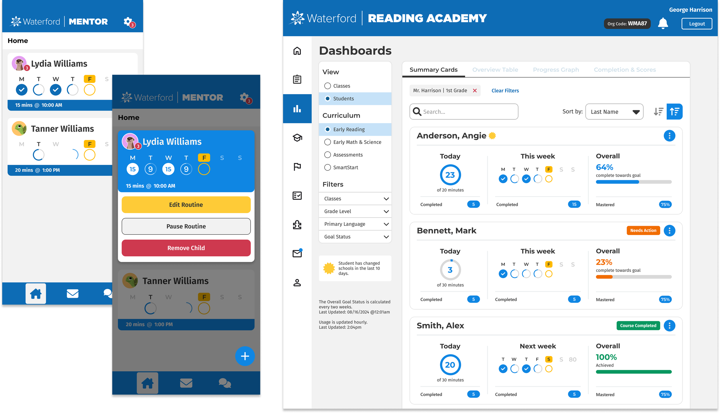
Scaling and Predictability
Visually Similar
Parents using the Mentor app can effectively communicate with teachers because the way student progress is shown is identical to what teachers would see.
Speedy Development
Because this was used in the main dashboard screen, development for this parent-facing application was smooth and quick.
Key Decisions
Incremental Update?
Even though this would have allowed us to roll out updates sooner, this path would create a wildly inconsistent experience when it was already struggling.
For this reason, I moved forward with a total overhaul, testing with users as I designed, rather than change over time.
Accessibility Considerations
The charts use many different colors, so it was important to design with different visual impairments in mind.
In addition to the colors, symbols were adjusted to be more prominent in new data visualizations, along with an updated legend.
Desktop or Mobile?
While I typically design mobile first, nearly all of our users of this platform use the web version via desktop.
The choice to start with a desktop version was to ensure it got into the hands of the majority of our users before adapting it to mobile.
Reflection
-
The collaboration between product and engineering was surprisingly smooth. There wasn’t a feature that couldn’t be adapted into the new design, and the design system work beforehand really played into the speedy success of this project.
-
In the parent-facing mobile application, there was a requirement to change the colors of the student's name bar to reflect which subject they were enrolled in. This disrupted the color scheme and introduced a number of new WCAG issues. I ended up using iconography to resolve this instead of the color change, but it took some convincing.
-
I think I would have changed the tables a little more than what I ended up doing. I was trying to keep key aspects of the experience similar enough that users wouldn’t have to completely re-learn how to read the data, but I think there are some improvements down the road. Maybe this was the best approach.