
Balancing Business and User Goals
UX Strategy
Tone
Voice
User Journey
Lead Generation
Senior UX Designer, Project Lead
Context
New User Registration
Entry Point & Lead Generation
The Upstart registration form served as the primary entry point for new users and a key tool for lead generation, capturing essential user information to drive engagement.
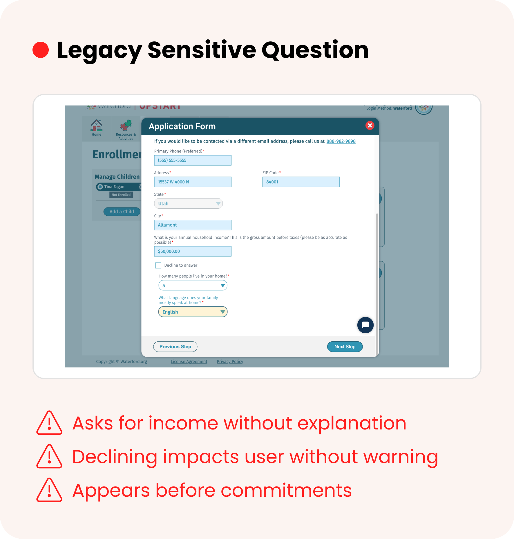
The Problem to Solve
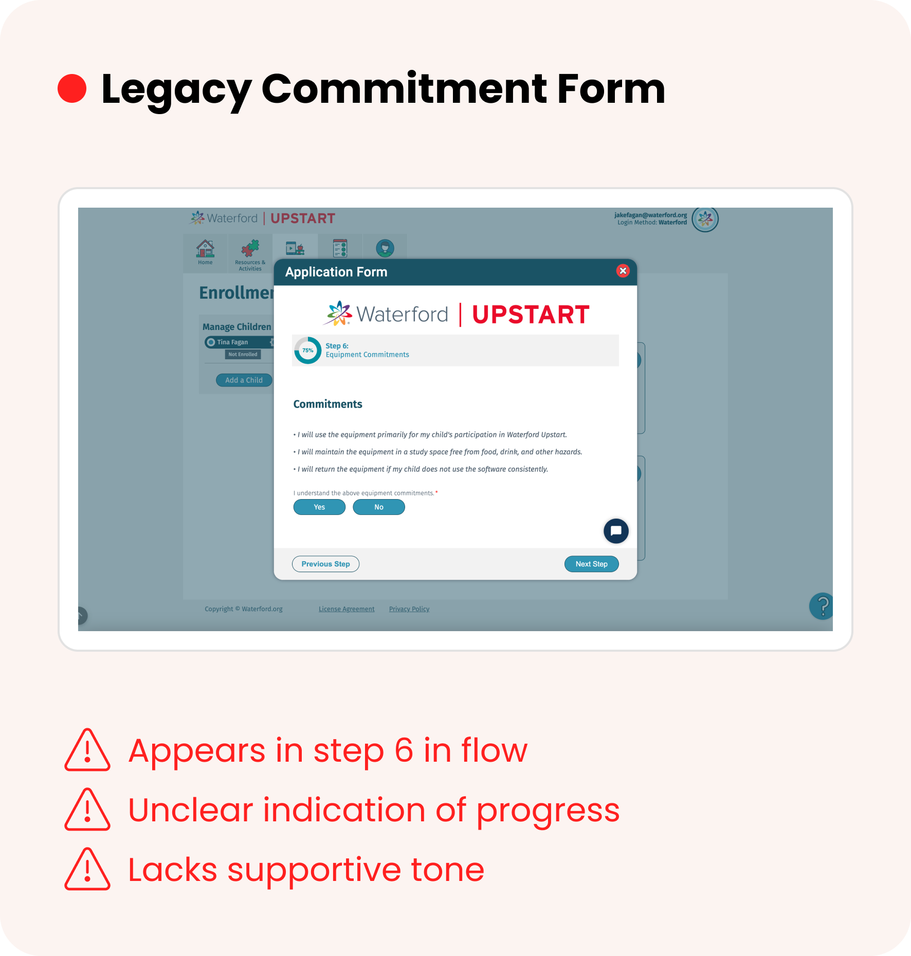
The form created friction for new users due to multiple issues:
Lengthy user flow
Invasive questions
Unwelcoming tone
Poor prioritization
Limited flexibility
The Impact of My Solution
-

Streamlined User Experience
Completion time reduced by 55%
Drop-off rate decreased by 40%
Mobile completion increased by 47%
-

Increased Conversion & Accuracy
Registration completion rate up 30%
Enrollment conversion up 18%
Data accuracy improved by 22%
-

Elevated User Confidence & Satisfaction
User satisfaction (CSAT) increased from 68% → 91%
Qualitative feedback highlighted greater trust, comfort, and clarity.
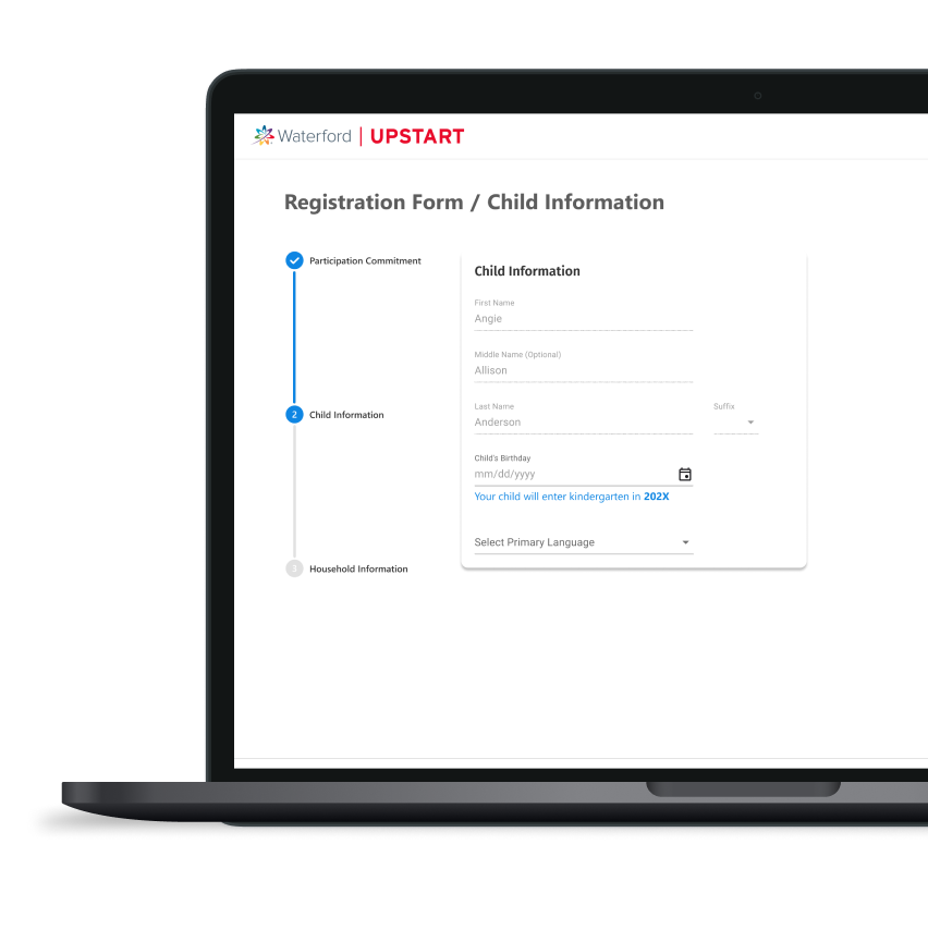
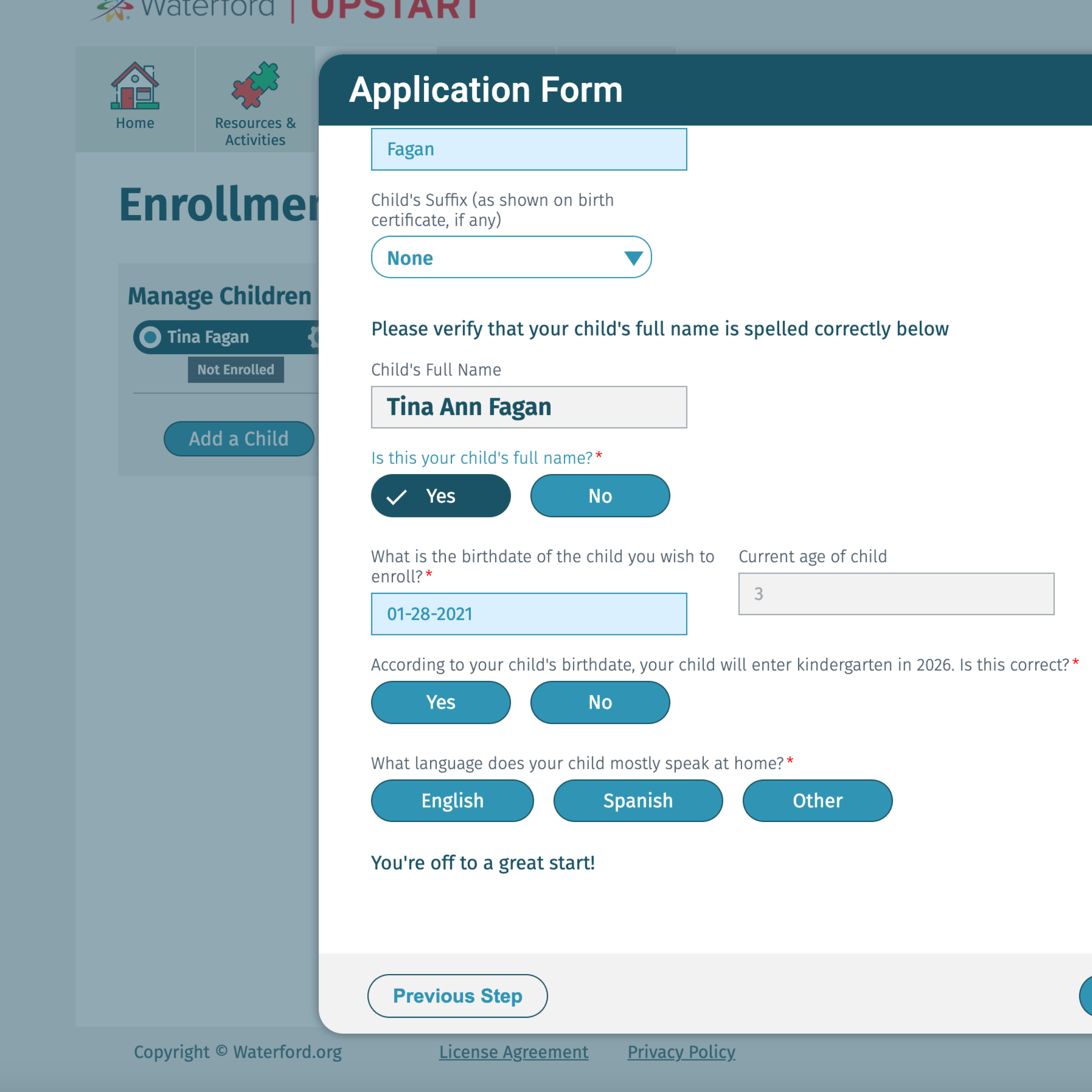
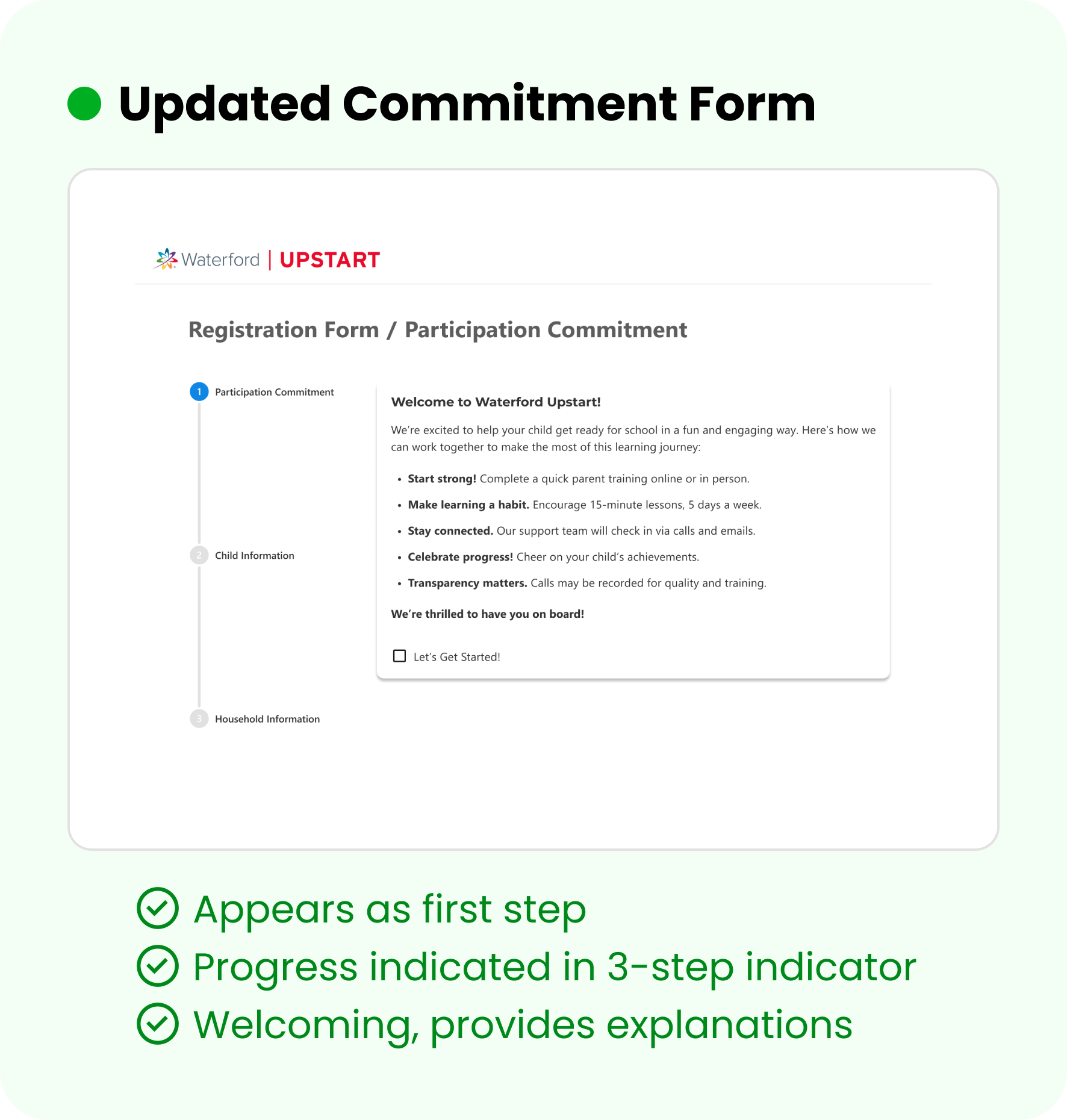
Registration Form: Before and After
This was the entry point for new users, it’s imperative that it creates a welcoming, smooth first impression.


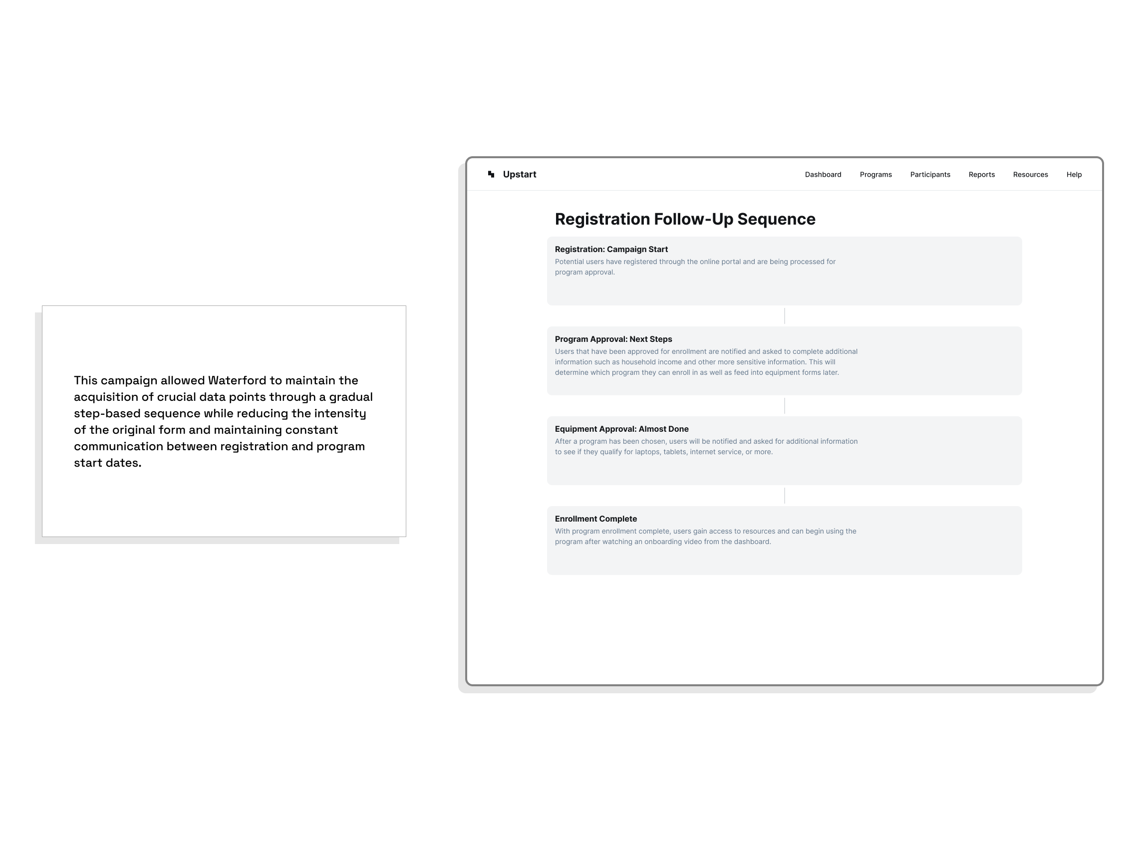
Discovered a critical UX issue: users could register months before the program but received no follow-up communication.
Identified this communication gap as a cause of retention issues, with families disengaging or forgetting their registration.
Recognized an opportunity to solve both data collection and engagement challenges with a single solution.
Additional Benefit from Update

Maintaining engagement between registration and program start.
Designed a lightweight onboarding experience that offered immediate value through educational tips and program previews.
Used progressive disclosure to collect additional data post sign-up, reducing form fatigue.
Built a mobile-friendly, guided form flow with clear instructions and error handling to improve completion rates.
Balanced user comfort and business goals by spreading data collection across multiple touchpoints instead of a single form.
Staged Communication Plan
Additional Information
Collaboration, audits, and more
Collaborative Effort
-
Marketing
Co-designed automated email touchpoints (registration confirmations, monthly updates, and countdown messages).
Partnered on content strategy and templates that delivered immediate value.
-
Product
Worked with product managers to streamline data collection, mapping each field to a business need and deferring non-essential inputs.
Applied progressive data capture to reduce friction, allowing the experience to prioritize completion before deeper data gathering.
-
Analytics & Stakeholders
Partnered with analytics teams to implement event tracking (completion rates, field-level drop-offs).
Worked closely with stakeholders to align UX goals with lead-generation objectives, ensuring both user satisfaction and business outcomes improved.
Research and Insights
Met with stakeholders to understand business needs and identify critical registration requirements.
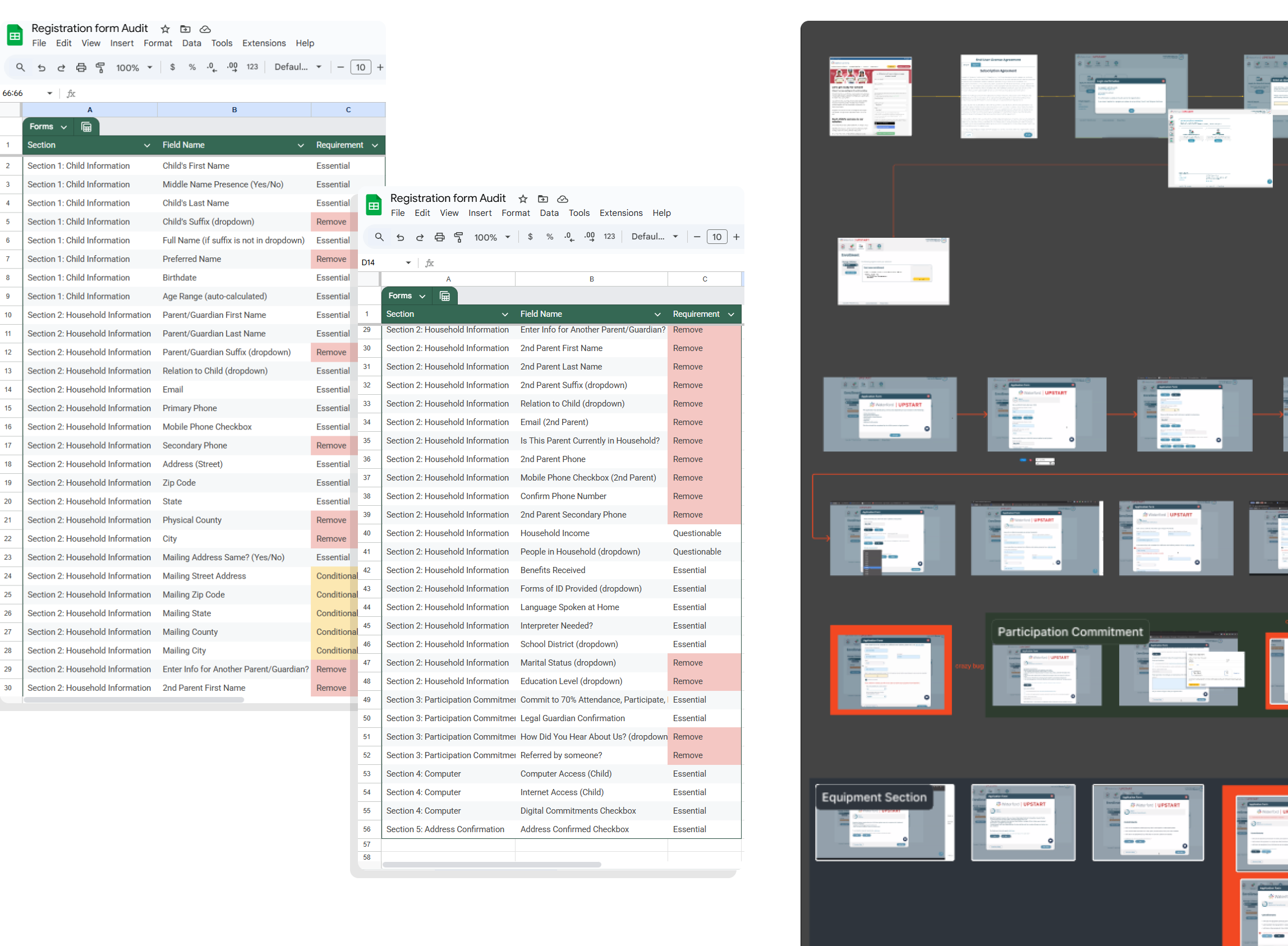
Conducted an audit of existing registration fields, analyzing which inputs were essential vs. unnecessary.
Reviewed user feedback and drop-off analytics to pinpoint friction points in the registration process.
Researched best practices in form design (progressive disclosure, minimal input) to streamline user flow.
Collaborated with cross-functional teams to align reduced field set with compliance and data requirements.
Key Decisions
-
Simplify Through Progressive Disclosure
Challenge:
The original registration form overwhelmed users with too many fields at once.
Decision:Broke the process into clear, guided stages—asking only for essential information upfront and collecting additional details later.
-
Build Trust with Transparent Messaging
Challenge:
Families felt the form asked invasive questions without context.
Decision:
Introduced friendly, conversational microcopy and contextual explanations for why certain data was needed.
-
Design for Mobile-First Accessibility
Challenge:
Over half of users registered on mobile, but the legacy form wasn’t optimized for smaller screens or touch.
Decision:Rebuilt the flow with responsive layouts, larger tap zones, and clear input validation for a smooth mobile experience.
Reflection
-
Implementation with developers went smoothly, as well as the collaboration with product and data teams. When the opportunity for the communication campaign emerged, we were able to pivot and develop a strategy without missing a beat.
-
When I initially removed the data fields and simplified the form (with guidance from a product owner), I didn’t expect there to be as much push back on the reduction in optional fields. However, this ended up being a blessing in disguise.
-
I would have started with talking to the data and research team directly on which fields were optional and why. As it turned out, some information can be interpreted differently when it’s being given from research to product to designer.