
Developing a Design System
UX Strategy
Accessibility
Scalability
Modularity
UX Outcomes
Senior UX Designer, Project Lead
Context
What Design Systems Do
A toolbox and Rulebook for Building Experiences
It’s a centralized framework of reusable components, visual styles, and usage guidelines that ensures consistency, efficiency, and scalability across a product or suite of products.
The Problem to Solve
The lack of design system created inconsistencies in all product areas
Waterford.org’s primary focus is on personalized learning, reports for educators, and being accessible for all users; this fractured design approach negatively impacted:
Engagement
Teacher adoption
Scalability
Accessibility
I lead the design and development of this system to remedy these growing problems.
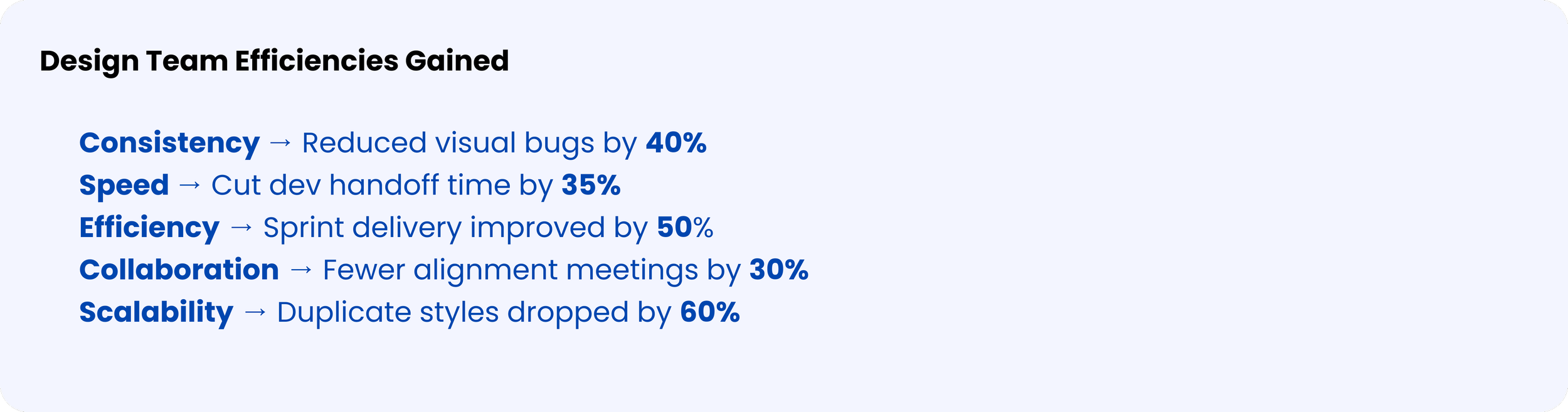
The Impact of My Solution
-

Front-End Library Synchronization
Development Speed +62%
Code Reusability +80%
Bug Reports - 40%
Deployment Time -65%
-

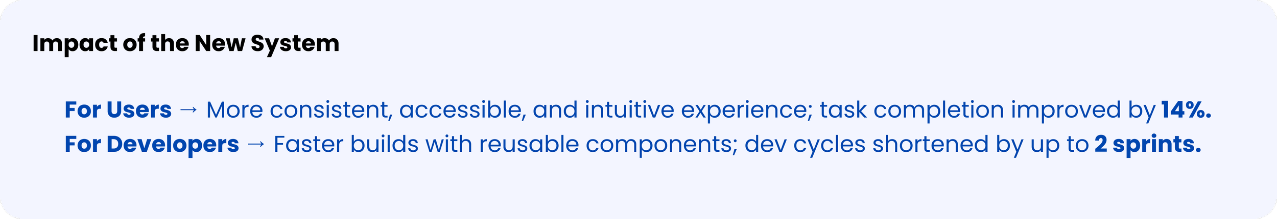
Task Completion Increase
Task Success +14%
User Satisfaction +38%
Error Reduction - 41%
Training Time -45%
-

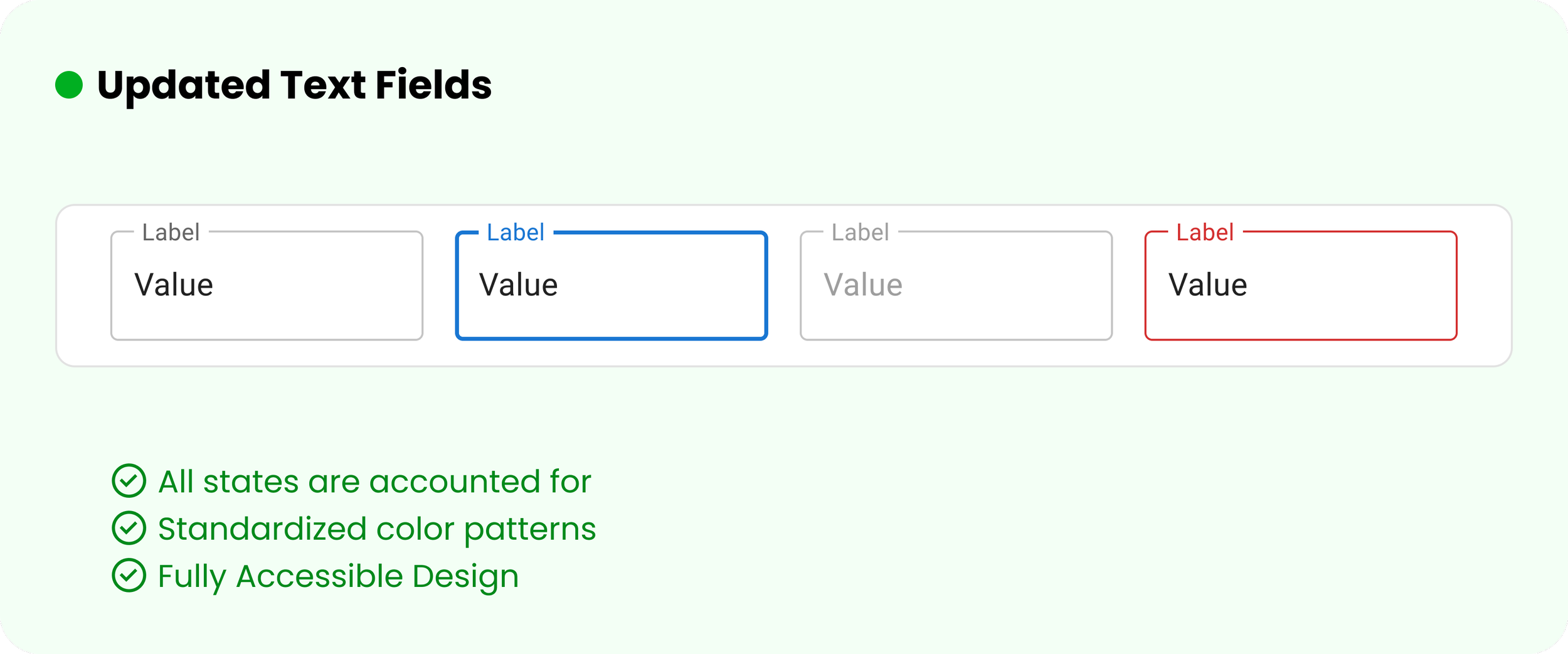
WCAG 2.0 AA Compliant
WCAG Compliance: AA
Keyboard Navigation: 100%
Screen Reader Support: 100%
Color Contrast: 4.5:1+
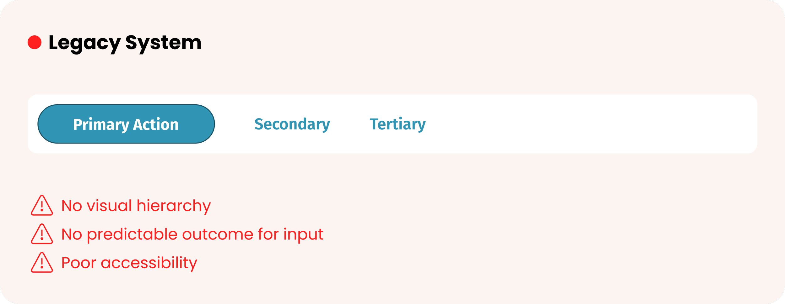
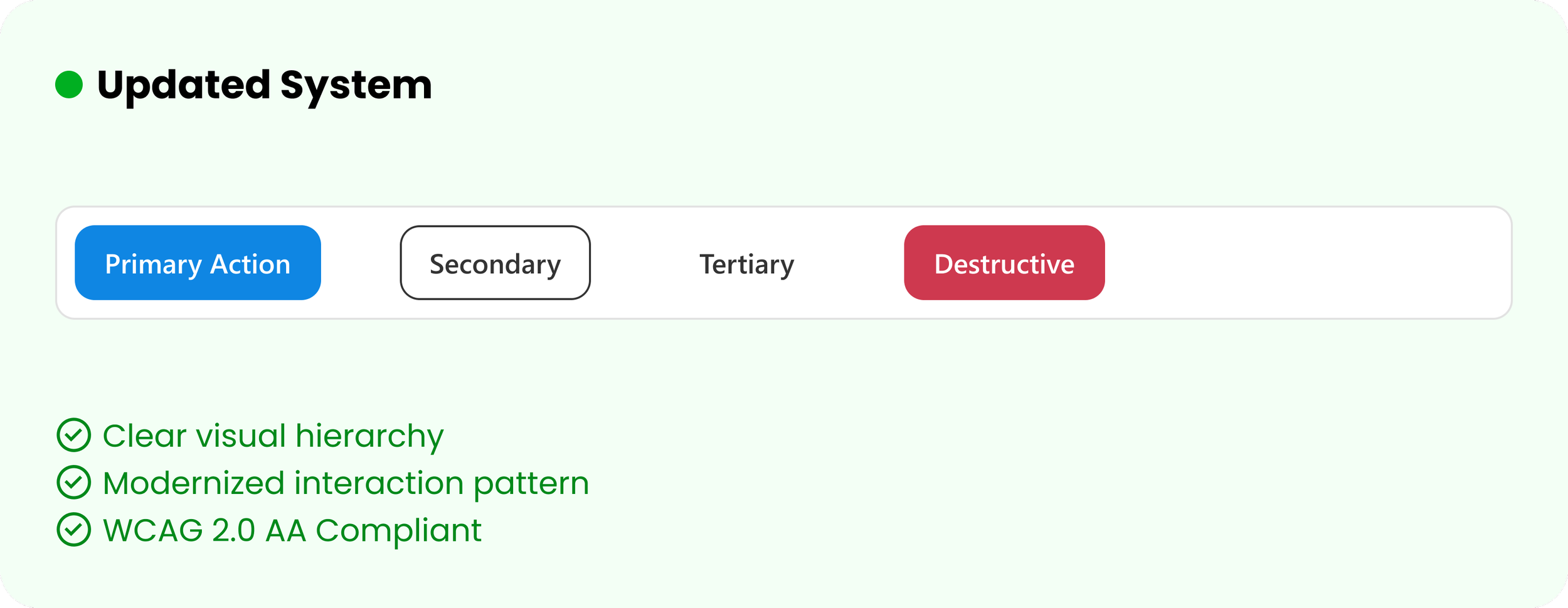
Design System Evolution: Before and After
Proper use of color, shape, and typographical hierarchy create an enjoyable, predictable experience for all users.

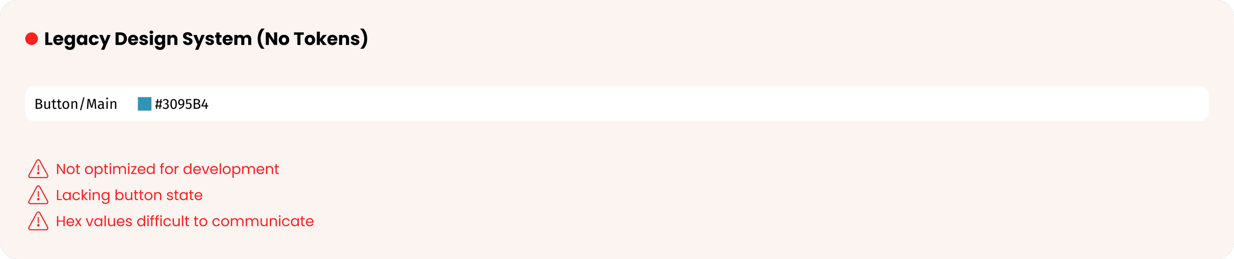
Tokens bridge the gap between design and development. A good semantic structure ensures scalability and communication for all teams.
Design Tokens
Additional Information
Rollout and Execution, Design Plan, Analysis, etc.
Rollout and Execution
Design Plan
Research and Insights
Heuristic Analysis of the Current Experience
Using the NNG’s 10 Usability Heuristics as the backbone of my audit, I was able to observe, recognize the impact of the observation, this, in addition to stakeholder and user interviews, allowed me to determine recommendations to resolve the problem.
-
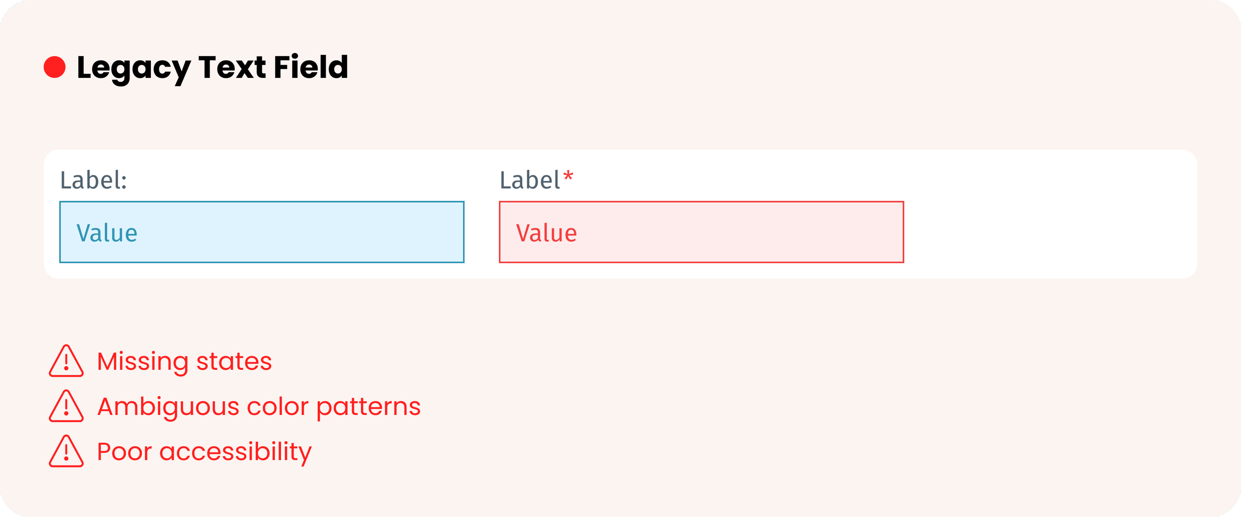
Observation: Different modules (e.g., Waterford Reading Academy, Math & Science, Parent Dashboard) use varying button styles, typography, and color palettes.
Impact: Teachers and parents switching between tools must reorient themselves, slowing down lesson prep or progress tracking.
Recommendation: Create a unified component library and brand style guide that applies across all Waterford products and portals.
-
Observation: Educational terms, icons, and navigation labels differ between the educator and parent views.
Impact: Parents may misinterpret features (e.g., “Assignments” vs. “Activities”), and educators may need to re-explain terminology.
Recommendation: Standardize vocabulary and iconography to align with early learning and classroom language.
-
Observation: Navigation structures vary between modules; “Back” or “Home” actions are not always in the same location.
Impact: Users — especially non-technical parents — may feel “stuck” in a section and resort to closing the browser.
Recommendation: Implement a consistent global navigation bar and predictable escape routes.
-
Observation: Progress indicators, loading animations, and success/error messages differ in style and placement.
Impact: Educators may not know if a student’s activity submission went through; parents may think a page is frozen.
Recommendation: Adopt a unified feedback system for all states (loading, success, error, progress).
-
Observation: Form validation (e.g., student enrollment, account setup) behaves differently across sections.
Impact: Users encounter preventable errors, such as incomplete forms or incorrect data formats.
Recommendation: Standardize validation rules, inline feedback, and error phrasing.
-
Observation: Similar actions (e.g., “Assign Lesson,” “Start Activity”) appear in different places or with different labels.
Impact: Users must remember where to find features instead of recognizing them instantly.
Recommendation: Keep recurring actions in the same location with consistent labels.
-
Observation: Shortcuts or quick actions for educators (e.g., bulk assigning lessons) are not consistently available.
Impact: Power users like teachers can’t rely on efficiency tools across the platform.
Recommendation: Define and apply a consistent set of accelerators and batch actions.
-
Observation: Some pages are dense with text and links, while others are sparse, with no clear hierarchy.
Impact: Parents may overlook important resources; students may be distracted by visual clutter.
Recommendation: Apply a consistent grid, spacing, and typography scale to create visual balance.
-
Observation: Error messages vary in tone, detail, and location.
Impact: Users may not understand what went wrong or how to fix it, leading to support calls.
Recommendation: Create a unified error messaging framework with clear, actionable guidance.
-
Observation: Help resources differ in depth and format between educator and parent portals.
Impact: Users can’t rely on a predictable support experience.
Recommendation: Centralize help content and align it with the unified design system.
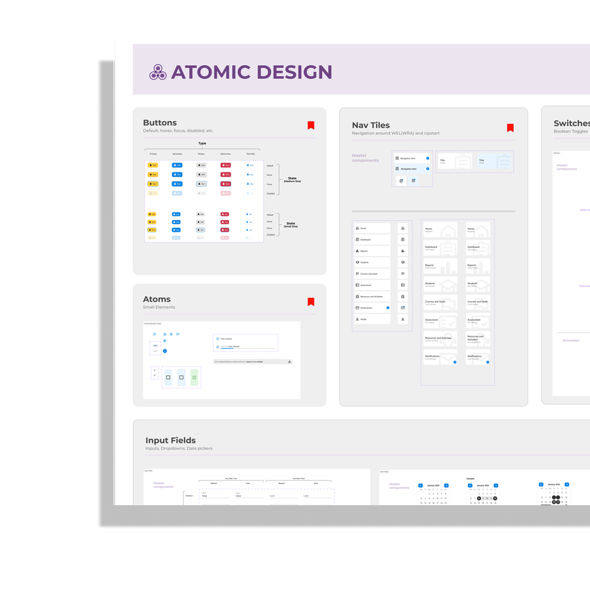
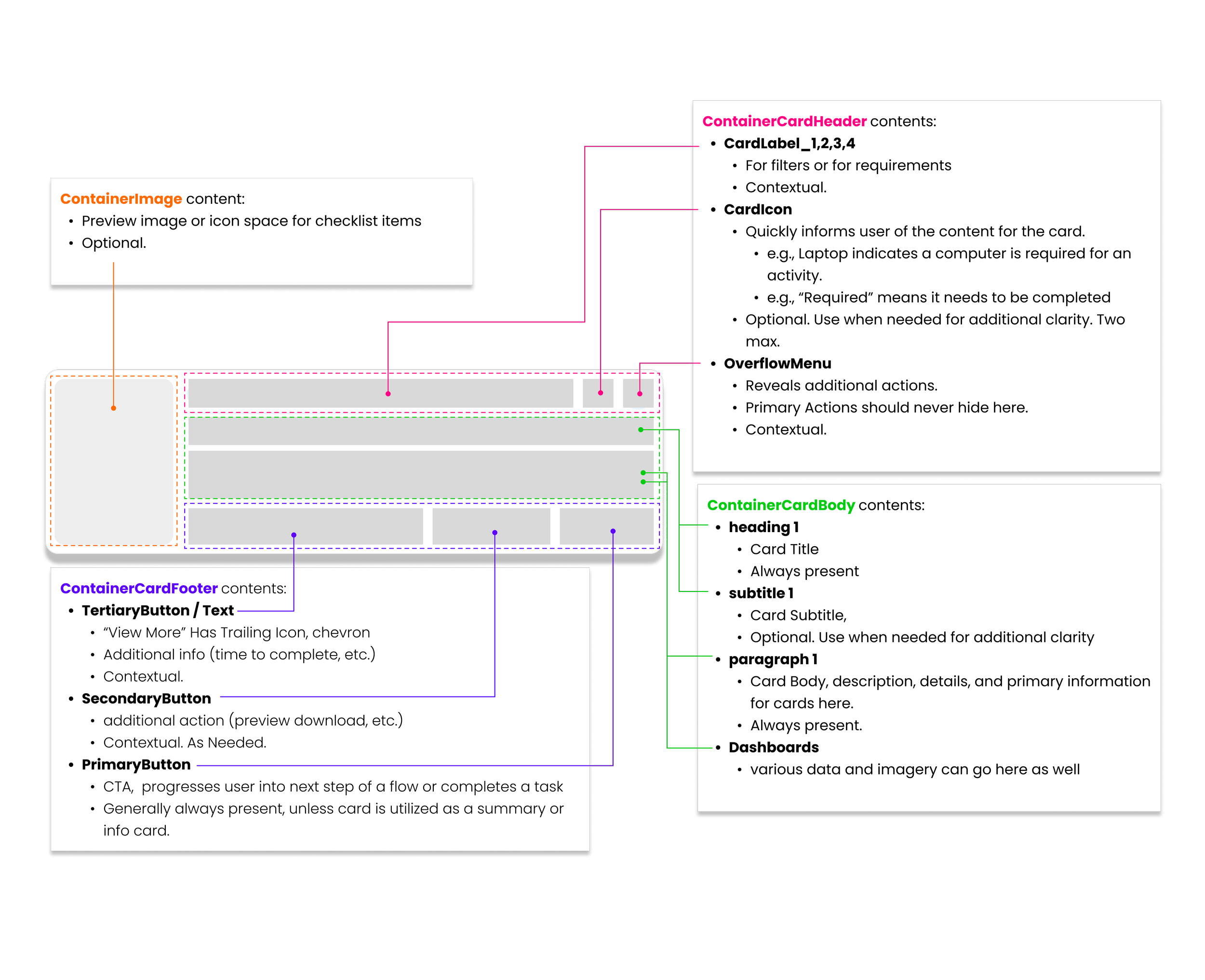
Component Breakdown
Why Start Here?
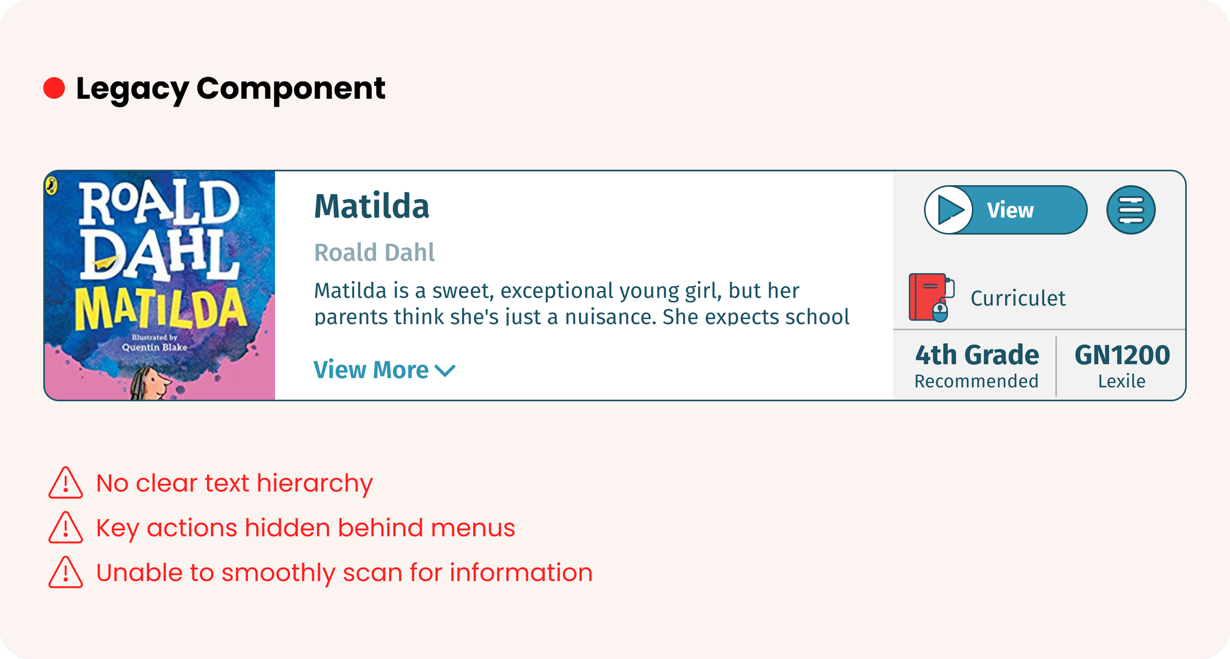
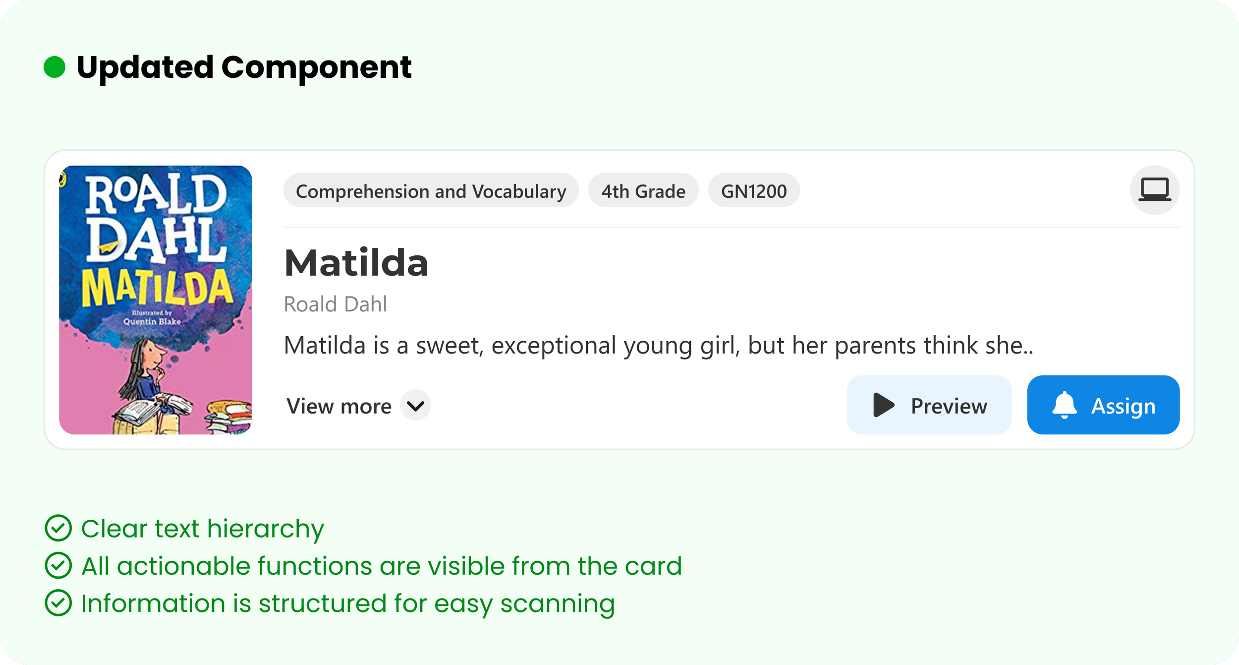
Cards were used everywhere in the product, starting with this made this biggest impact.
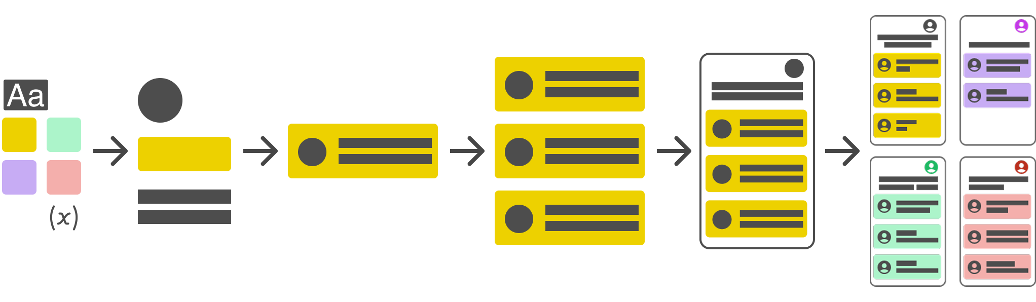
Modularity
Designed to be flexible, able to accommodate the following without needing to make one-off components:
Summary cards
Complex Dashboard
Calls to Action
Checklists
Videos
Key Decisions
Everything from Scratch?
Why recreate the wheel? We worked primarily with React, so in many cases, I pulled in components from Material Design and modified them with our branding. Components like calendars, drop-downs, and input fields.
This decision enabled the UX team to leverage proven components without additional testing or iteration, while accelerating development through ready‑made compatibility with React frameworks.
Naming Tokens
Because nothing was tokenized before I started this project, we needed a flexible system for naming our tokens so that developers and designers who had not worked within this technical of a system could easily understand what they were looking at.
I decided on a flexible, human‑centered naming structure that balanced clarity and technicality with future extensibility, ensuring the system could grow without becoming cryptic or inconsistent.
Establishing Brand Foundations
I had to decide how to update and extend Waterford’s brand identity into a scalable UI language. Collaboration with marketing and product allowed me to establish an accessible color palette, typography hierarchy, and iconography guidelines.
This updated the brand while meeting WCAG standards and staying true to its look and feel. Creating a more welcoming aesthetic while also more accessible than ever.
Reflection
-
Honestly, I was surprised at how smooth collaboration across teams went. The developers were excited and eager to establish this as they had been wanting a design system for years, and product appreciated being able understand the value of having such a scalable system at the organization.
-
One thing I underestimated was how much effort it would take to drive adoption across teams. I assumed that once the system was documented and components were available, teams would naturally start using them. The truth of the matter was that many designers (and some devs) were comfortable with their existing workflows and hesitant to change. Adoption required more advocacy, training sessions, and real‑world examples to show the value of the system. While it slowed initial rollout, the extra investment in onboarding ultimately established more credibility and name recognition in the UX team and more advocacy for the system.
-
If you couldn’t guess from the previous question—I would invest earlier in onboarding and education for the teams adopting the system. While the technical foundations—tokens, components, and governance—were pretty solid, I realized that adoption is as much about people as it is about process. Providing more hands‑on workshops, usage examples, and quick‑start guides up front would have reduced friction and sped up trust in the system.